Data Visualization Techniques: Bringing Insights to Life
Introduction to Data Visualization
Data visualization is a powerful tool for transforming raw data into meaningful insights. In this blog post, we explore various data visualization techniques and their applications in bringing insights to life.
Importance of Data Visualization
Data visualization plays a crucial role in aiding decision-making processes, facilitating communication of complex ideas, and uncovering hidden patterns and trends within data sets.
Types of Data Visualization
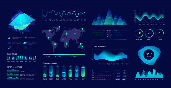
There are various types of data visualization techniques, including charts, graphs, maps, and infographics. Each type serves a specific purpose and is suited to different types of data and analytical tasks.
Bar Charts
Bar charts are commonly used to compare the values of different categories of data. They are effective in visualizing trends over time or comparing quantities across different groups.
Line Charts
Line charts are ideal for showing trends and patterns over time. They are often used to visualize continuous data, such as stock prices, temperature fluctuations, or sales trends.
Pie Charts
Pie charts are effective for representing proportions or percentages within a whole. They are commonly used to illustrate market share, budget allocations, or demographic distributions.
Scatter Plots
Scatter plots are used to visualize the relationship between two variables. They are particularly useful for identifying correlations or patterns in data sets.
Heatmaps
Heatmaps are graphical representations of data where values are depicted using colors. They are effective for visualizing large datasets and identifying areas of high or low concentration.
Infographics
Infographics combine text, images, and data visualizations to convey information quickly and effectively. They are popular in presentations, reports, and social media posts.
Interactive Visualizations
Interactive visualizations allow users to explore data dynamically, providing a more engaging and immersive experience. They are often used in data dashboards and online applications.
Conclusion
Data visualization is a powerful tool for uncovering insights, communicating information, and driving decision-making processes. By employing various visualization techniques, organizations can gain a deeper understanding of their data and make more informed decisions.
Recommended Hashtags
#DataVisualization #DataAnalytics #DataScience #VisualizeData #BigData #InformationVisualization #DataInsights #Analytics #DataViz #IAQMC